top of page

TOBACCO COLLECTION
Marketing Campaign
THE BRIEF
For the autumn of 2025, Vampire Vape planned to launch a new tobacco collection. Four new flavours were proposed, offering sweeter notes alongside richer, muskier tobacco flavours. Traditional tobacco users tend to be older and more accustomed to classic products, so launching this range was always going to be a challenge, particularly when trying to appeal to a younger, more modern audience. There were many creative directions the campaign could take, so choosing the right messaging to engage both new and existing customers was pivotal.
STRAPLINE IDEAS
Thinking about the origins of tobacco and where it first came from was key. It was also important to consider the prestige of the flavours, what they are commonly associated with, and the demographic of the user. These insights helped shape a concept that linked directly to the style and character of the flavour range.
BACK TO BASICS
OLD FLAMES NEVER DIE
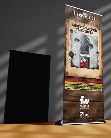
MOST WANTED FLAVOURS
CLASSICS REDISCOVERED
I chose the highlighted strapline because of the story that could be told through both the concept and the wording. Linking it back to the Wild West and cowboys adds meaning by referencing chewing tobacco, which could appeal to an older audience who grew up watching these types of films. This creates a connection to pop culture and evokes a sense of nostalgia. Furthermore, it also resonates with a younger audience through the recent resurgence of country and western music in mainstream culture around the world.
INITIAL CONCEPTS
Tobacco Collection logo sets the tone for the poster, clearly stating what the product is. It lets the customer know what they're buying before taking in the rest of the design.
Product placed at the centre of attention gives the customer a clear idea of what is being released. The bottles also provide strong branding for Vampire Vape.

Basics relating to the origins of these flavours and the raw extraction process of tobacco, giving a link back to its history and roots.
Product embedded within tobacco leaves, linking back to the raw ingredient and the origins of the flavours.
Strapline adds intrigue, making the customer wonder why these flavours are so sought after. Without tasting them, they will never know. This could potentially lead to a sale, with the consumer wanting to try them.

Cowboy / Western-themed concept appeals to both audiences we are trying to attract. Country music has grown popular with a young demographic, whilst references to old Western films relates to the older age range.
Singular product is shown more clearly, while the branding stands out within the monochrome design. It also adds further intrigue, as the full bottles aren't revealed.
The text gives the effect of a burning flame, linking to the overall design of the poster and the Polaroid picture burning.

Monochrome background gives an older feel, as if it was set during the Western era. The subdued background also allows the colourful elements to stand out.
Polaroid pictures are popular in the modern age, allowing a younger demographic to capture memories the way their parents will have done. This gives a nod back to where they originated.
COLOUR SCHEME
CHOSEN DESIGN

VISUALISATION


bottom of page