top of page

HEISENBERG COLLECTION
Marketing Campaign
the brief
For the winter of 2024, Vampire Vape planned to release an extension of their most popular product, Heisenberg. This liquid has been the quarterback of the brand for many years, remaining popular for over a decade. Its sweet flavour and distinctive blue-coloured liquid are difficult to replicate, which is what makes it so special. Vampire Vape wanted to release four new Nic Salts flavours, positioning them as an extension of the Heisenberg "family".
strapline ideas
Taking the key meanings and characteristics behind Heisenberg, along with its original strapline of "The King of All-Day Vape", was key to creating our message. The new flavours being an extension of the family could also be an interesting route to explore, potentially leading to further extensions in the future (providing this one succeeds).
FIT FOR A KING
heirs to the throne
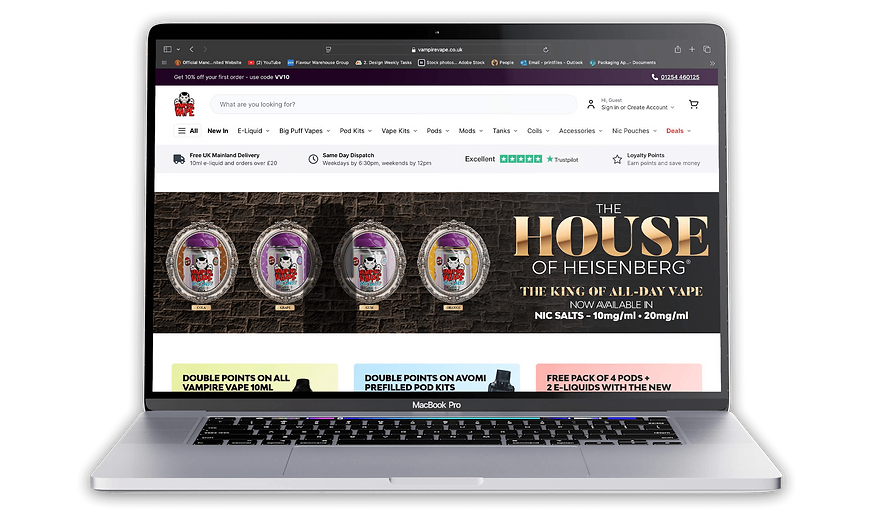
THE HOUSE OF HEISENBERG
royal flush
Linking it back to a house was interpreted in different ways. This could be seen as a house of cards, a family, or even a royal house. Linking royalty and a family house was key in choosing the strapline we did. This creates a connection to adding to the "King's" royal family, which could be seen as a home or house. This gives the new products an esteemed feel, making them appear higher quality and therefore more desirable.
initial concepts
Royal blue background links back to Heisenberg's colour, making the product easily recognisable for the consumer.
Can't see any of the full products or listed names, which seems counterintuitive as customers won't know what it is. It could be better used as a social media teaser for a further developed design.

Gold, glimmering font gives the idea of royalty and creates a sophisticated, pristine feel, making the product appear higher quality. Emphasises the ranking of Heisenberg as the companies best-selling flavour.
Products front and centre, showing the consumer exactly what they are. Contrasted with the overarching theme of Heisenberg, shown through the shadowed bottle.

Theme of an old-fashioned castle is created, making the product appear more regal and appealing to an older demographic. Giving it a higher standing, which it has as the best-selling flavour.
More of the product is shown, but it is still quite cryptic in terms of the details provided. Flavour hints are given on the cards, but there are no real visuals to entice the customer at first glance.

Blurred cards in the background really emphasise the look and feel we are trying to achieve. This also creates strong potential for further collateral, such as videos featuring falling cards and other motion-based assets.
colour scheme
CHOSEN DESIGN

visualisation


bottom of page