top of page

PINKMAN COLLECTION
Marketing Campaign
THE BRIEF
The Pinkman flavour is a best-seller for Vape Vampire in the e-liquid industry. Inspired by the protagonist Jesse Pinkman from the hit series Breaking Bad, the flavour is a fruity blend of summer fruits & fresh berries. It is seen as one of the two best sellers in the industry, alongside its partner in crime, Heisenberg.
However, years have passed & the hype of Pinkman has slowed ever so slightly. To counteract this decrease in sales, a new collection was being introduced with four new spin-off flavours. This was an attempt to re-ignite an old flame in Pinkman & bring back existing, loyal customers, whilst adding variation to it & attracting new customers.
STRAPLINE IDEAS
Linking the hook to the key feature of the product was key. Its pink-coloured liquid is unique amongst competitors, so this was seen as a key selling point for the product. The new flavours also add a stronger dimension to the original, with a new and exciting taste that needs to be celebrated.
PINK UP THE VOLUME
TURN UP THE PINK
PAINT THE TOWN PINK
PINK PARADE
Due to the story that can be told & the creative freedom it provides, the chosen strapline was 'Paint the Town Pink'. This could lead down a graffiti style route, which could create a nice aesthetic with sprayed style lettering. It could also look realistic, with guerrilla marketing tactics.
INITIAL CONCEPTS
Spray letters style text, in the key pinkman colour to give that graffiti style we were intending.
Clear branding on the design gives good brand recognition. Could be blended better to look more realistic.

Key usp's still to be decided, but having the flavours & range on there as a key message homes in on how grand the collection is.
Concept shows artists creating graffiti art, showing the meaning behind the strapline.
Clear branding on the design gives good brand recognition.
Product images on a white background & at a good size & easily visible for the consumer.

Clear contrast between strapline & background, clear definition. Font could be seen as too drastic potentially.
Key usp's still to be decided, but having the flavours & range on there as a key message homes in on how grand the collection is.
Lots of brand logos for clear brand recognition, could have done bigger with fewer iterations.

Pink background & feeling, linking to the liquid colour & tagline.
Product faced concept with the product being the key focus for the consumer.
COLOUR SCHEME
CHOSEN DESIGN

Font simplified but still giving the theme style.
Darker grey background gives better contrast to allow the pink to stand out as a focal point for the design, attracting the eye more easily.
Effect of graffiti artist more realistic, spraying on the brand logo onto the wall.
Product emphasised further by being a bigger size.
VISUALISATION


Roller Banner
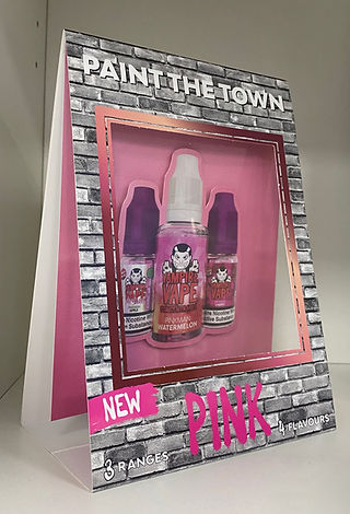
A5 Tent Card

Car Air Freshener

bottom of page