
VAMPIRE 10K
Packaging Solutions & Campaign Development
THE BRIEF
This project shows the whole process of development, from initial branding to packaging, all the way through to a marketing campaign and supporting assets. Vampire 10K is a brand new hardware device featuring 10+2ml prefilled pods. It was developed in response to the UK disposable vape ban, creating an alternative product that offers a similar user experience while remaining compliant with regulations. In this project, we aimed to create a new brand from Vampire Vape that could stand on its own while still staying true to the company's roots. As a large-scale project, it required a collaborative team effort to develop the branding and create a fresh, exciting identity.
ORIGINAL LOGO


Despite Vlad being seen as the icon and mascot of the brand, regulations won't allow him to remain part of the branding, either in the UK or internationally. This is due to the cartoon style, which could attract kids to an over 18 product. Therefore, he needs to be removed from the logo.
Purple clouds background is a key brand asset as part of the brand guidelines, used consistently across all collateral.
Modernise the font to a cleaner, sans-serif type face. Make it more legible and fit in with a more sophisticated product.
LOGO DEVELOPMENT


CHOSEN LOGO



-
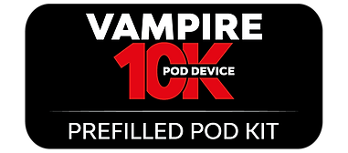
Cleaner, sans-serif font gives a modernised feel. Takes away from the gothic nature of the original Vampire Vape logo, and gives the individuality it requires to distinguish itself as a separate brand.
-
10K standing out in red, to highlight the number of puffs in the device. Within the market, this is a key selling point for customers when choosing a product, as convenience of use is required.
-
The 'Pod Device' text also differentiates from Vampire Vape, showing it is a different type of product. This reduces any customer confusion that may be had between names, as they know that VV is for e-liquids specifically.
PACKAGING DEVELOPMENT


chosen design

-
Ready to Vape is positioned at the top as a clear message to the consumer. This is likely to be the first thing they see and is one of the most important pieces of information. Consumers want something as close to disposables as possible, so highlighting that the device is ready to vape reinforces its convenience. No fuss, easy to use, and perfect for a night out, it appeals to a wide range of users.
-
The flavour name is clear, making it easy for consumers to identify the product on shelf and know exactly what they are buying.
-
The device is clearly shown and positioned upright, providing an easy-to-understand visual of the new product. The brand logo is also prominently displayed in the centre, reinforcing brand recognition.
-
The diagonal zig-zag pattern in the background creates a clean, modern look for the packaging. It contrasts well with the white background, allowing the device colours to stand out while also aligning with the visual style of competing products.
KEY CONCEPT DEVELOPMENT
-
Make the product prominent and easy for the consumer to view.
-
Keep the brand logo visible, whether on the device itself or elsewhere within the design.
-
Maintain a futuristic, modern aesthetic to appeal to a younger audience while still resonating with Vampire Vape's core middle-aged demographic.
-
Use bright colours, taking inspiration from the vibrant colours of each device.
-
Highlight the key USPs of the device, particularly its compact size and Turbo Mode.


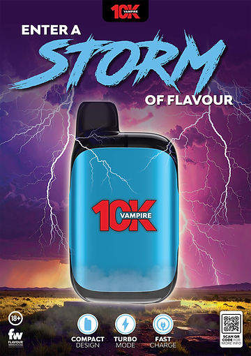

FINAL DESIGN

Tagline emphasises the key USP of the device, highlighting that it easily fits in your pocket and is ideal for travel and everyday use. The use of the brand fonts also gives a subtle nod back to Vampire Vape and its original brand identity.
Device is prominently positioned at the centre of the design, making it easy for consumers to identify the product while also showcasing the brand logo clearly.
Other key USPs are included, giving an in-depth overview of everything that makes the device worth buying.
POINT OF SALE


Window Sticker / Shelf Wobbler


