VAMPIRE VAPE
Packaging Solutions
THE BRIEF
After creating a positive solution for the rebrand of Vampire Vape, our next challenge was just as significant. The packaging design of its key products had become outdated, too similar across the range, and was no longer standing out on the shelf. The lack of inner boxes across the UK range meant the products had very little shelf presence, allowing competitors to capture consumers' attention more effectively. This led to declining sales, reduced brand recognition, and other brands gaining market share. Vampire Vape needed a fresh appeal and an opportunity for consumers to fall in love with the brand once again. The flavours and product quality were already there, with its accreditation as a member of 'Made in Britain' serving as a key selling point. However, the excitement and overall experience surrounding the products were no longer keeping pace.
There were two projects that required solutions. The first focused on the 10ml Freebase range, the standard e-liquid product that is widely used around the world. Alongside this, a new range was proposed in the form of 'Vampire Vape Xtreme'. This was a new take on the existing 10ml Nic Salts range, offering stronger flavours and more concentrated versions of the UK's and international markets' most popular flavours. There needed to be clear contrast between the two designs to differentiate the ranges. They also needed to stand out on the shelf and be easy to shop from across the counter. Customers should be able to walk into a store and instantly understand what they are buying, making the purchasing experience as seamless and stress-free as possible.
THE EXISTING DESIGN
10ML FREEBASE
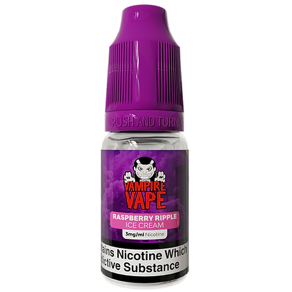
Purple cap blends with the background and doesn't provide enough contrast to allow the bottle to stand out.
Purple clouds background is an interesting design, but it is used across every piece of packaging. With over 700 SKUs, this creates confusion for the customer when shopping for products.
Gloss finish on the label allows the detailing of the clouds to stand out, showing the intricacies of the background.
10ML NIC SALTS
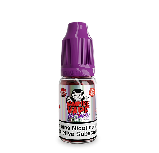
Spot UV effect creating a shimmer finish on the label, creating contrast to Freebase. However, still having many SKUs looking the same within this collection reduces individuality.
Purple cap ties in with the Nic Salts logo on the label. Gives consistency throughout the packaging, matching with the Freebase bottle.
Flavour name is very close to the logo, making the space congested and harder to read.
CHOSEN BRANDING




CHOSEN DESIGNS


VISUALISATION
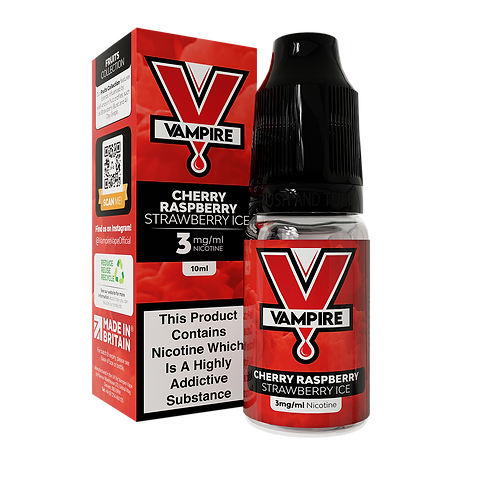

10ML FREEBASE

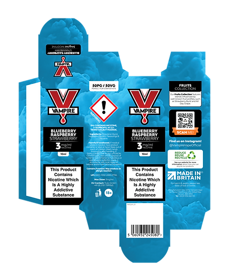
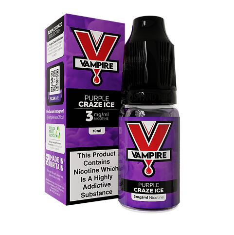
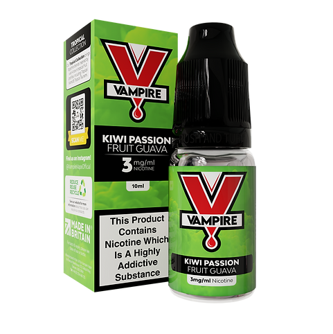
Brand recognition with customers was key, so not diverting too far away from the original packaging and the design that has been loved by local shoppers for years was the main design choice. Due to this being the most commonly purchased product since the brand was established in 2012, keeping it recognisable was essential from a marketing perspective. The decision to give each label and box a different colour, representing the flavour they contain, allows for a much easier shopping experience. The process has been simplified, allowing customers to enter a shop and instantly identify what they want to buy. In the past, this would have been more difficult due to the lack of a box and limited brand presence, making the process longer and a struggle for both shop assistant and customer. This length of time could potentially lose a sale, and a customer.
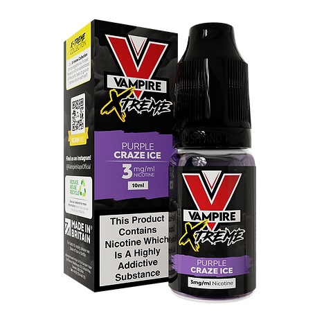
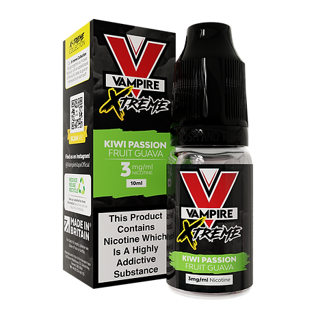


XTREME
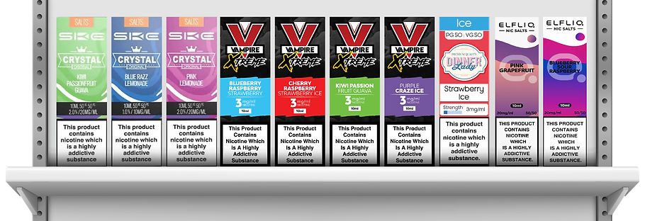
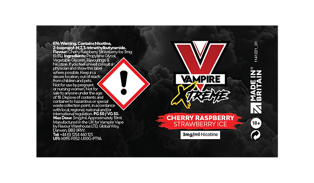
With brand recognition still in mind, the brand-new Xtreme range provided an opportunity to try something new. Despite wanting to keep the same background to maintain a consistent and sophisticated brand identity, the contrast of the packaging was clear. Despite being a dark colour, black will stand out on shelf by creating a modern, clean and sophisticated aesthetic. No other competitors will have this visual style. The contrast of the flavour colour tab also allows for easier shopping. The black creates a strong base for the colours to thrive, while also playing a key role in the overall look and feel of the product, especially when displayed on shelf.
AN XTREME MARKETING CAMPAIGN

Sky Diving - World's Largest Fall for an E-Liquid

Formula 1 Car - World's Fastest E-Liquid

Homepage Banner for Key Wholesalers and Stockists (B2B & B2C)

Everest - World's Highest E-Liquid

Store Takeovers
Due to being a new range, we had to spread awareness quickly about this new product line. We believed it would be a real success due to popular flavours being released at higher strengths. Coupling this with contrasting yet recognisable branding, it created a strong project. However, we needed to market it differently. Extreme sports capture people's attention due to the level of danger involved, creating excitement and keeping audiences engaged. By collaborating with these types of events and becoming the first-ever e-liquid brand featured in certain extreme scenarios, we believed this would create intrigue among consumers. Even for people who don't vape, the thought of an e-liquid bottle being placed in these environments would be enough to generate conversation. The impact this could have on social media, despite the challenges caused by regulations, would allow awareness to spread quickly. This was about being able to reach the audience before anyone else.